MAKE COMICS: Lettering
Jan. 18th, 2008 01:46 pmThis is by no means the last word on lettering, just me having my say on same. The low standards in most manga lettering makes me twitch. The missing of basic forms (because they're not taught) make me twitch. The use of apostrophes as if they were LOL instead of useful punctuation to indicate possessives makes me twitch.
The distance between good lettering and so-so lettering and bad lettering is small. In my unhumble opinion, it's worth bothering with.
So, what the fuck do I know?
Besides my near-miss English minor (I left college with one credit to go so I could draw comics, mmmboy), I've been a letterer for 20+ years, mainly of manga (when it still required sound FX and art retouch). My mentor was Tom Orzechowski.
Richard Starkings once gave me a t-shirt. ^_- (Seriously, we're pals. Starkings is a good guy.)
LETTERING RESOURCES
The GRANDADDY: Comic Craft's Balloon Tales: http://www.balloontales.com/
The best place to start is BT's Lettering: Word Arrangement: http://www.balloontales.com/tips/arrangement/index.html
It gives the basics on making lettering look like someone who knows what they were doing did it.
FONTS:
Most free fonts are worth what you pay for them. Obviously, Comic Sans is right out. You can get a gazillion fonts by putting "free font" into Google. The problem is a lot of those fonts are downloadable, but not legal to use without a fee. Use caution.
CC's fonts are the best you're going to get, but they're not free. HOWEVER, they have an excellent font package "WildandCrazy" that gives you a regular and bold italic font set and SFX for $29.95.
http://www.comicbookfonts.com/zap/catalog.html?item=fonts:zp1&sid=0001Mv6yHafzLfQer07q7R6
Nate Peikos' Blambot.com is a great resource for fonts, but even the free fonts are NOT for use in projects from DC, Marvel, Dark Horse, Image, etc.
His Pro Fonts are only $20./each, and gets you a license to use them.
http://blambot.com/fonts.shtml
BALLOONS:
Blambot has FREE EPS balloons and SFX, and they're free for non-profit and commercial use.
http://blambot.com/balloons.shtml
AVOIDING COMMON MISTAKES:
When lettering in all-caps, the serif (that means with the lines at the top and bottom) "I" is ONLY used for the possessive pronoun "I." This includes "I'm" "I'd" "I'll."
A serif "I" does not belong anywhere else.
I know you can pick up any comic from nearly any company besides DC and Marvel and see this standard of good form bent (ALL sans-serif "I" even for the possessive form), bent again (ALL serif "I"), or broken beyond fixing (a capricious mix of serif and sans-serif "I", someone possessive-correct, sometimes not, mostly a big mess) BUT THAT DOESN'T MEAN THIS IS GOOD FORM OR EVEN "OKAY."
It's CRAP form.
GRAMMAR:
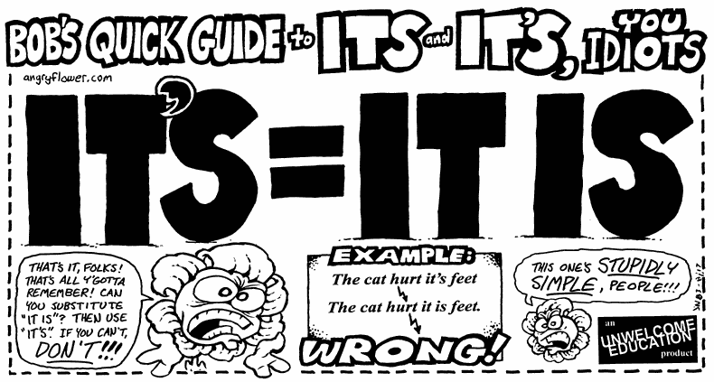
"Its" is the correct possessive form, not "It's." ("Its head blew up!") Stupid, huh? But correct. "It's" is a contraction. ("It's going to be a long fucking night.")
Oh yeah: "hers," not "her's."
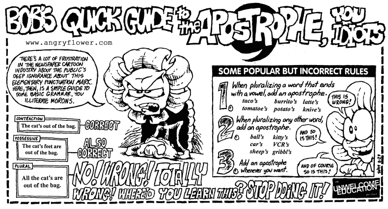
The apostrophe "s" ('s) is not, as Dave Barry once said, to let you know an "s" is coming. It's for possessive and contractions, and that's it. (Lea's, Nate's, that's.)
Use a spellchecker, but don't take it at its word. Speelcheekers are only az S-Mart as the dickshunary in them. Use dictionary.com and/or a paper dictionary, too.
Hope this helps! Feel free to link to it, re-post (with a link), and so on.
ETA: Bob the Angry Flower explains the Apostrophe S and Its v. It is.
(Thanks to![[livejournal.com profile]](https://www.dreamwidth.org/img/external/lj-userinfo.gif) mattg and darthparadox for the links!)
mattg and darthparadox for the links!)
P.S.: For extra fun, watch and see how many comics-related sites, movies, shows and events break the rule of the serif I/sans serif I.
Start with the posters for SIN CITY, and go from there.
The distance between good lettering and so-so lettering and bad lettering is small. In my unhumble opinion, it's worth bothering with.
So, what the fuck do I know?
Besides my near-miss English minor (I left college with one credit to go so I could draw comics, mmmboy), I've been a letterer for 20+ years, mainly of manga (when it still required sound FX and art retouch). My mentor was Tom Orzechowski.
Richard Starkings once gave me a t-shirt. ^_- (Seriously, we're pals. Starkings is a good guy.)
LETTERING RESOURCES
The GRANDADDY: Comic Craft's Balloon Tales: http://www.balloontales.com/
The best place to start is BT's Lettering: Word Arrangement: http://www.balloontales.com/tips/arrangement/index.html
It gives the basics on making lettering look like someone who knows what they were doing did it.
FONTS:
Most free fonts are worth what you pay for them. Obviously, Comic Sans is right out. You can get a gazillion fonts by putting "free font" into Google. The problem is a lot of those fonts are downloadable, but not legal to use without a fee. Use caution.
CC's fonts are the best you're going to get, but they're not free. HOWEVER, they have an excellent font package "WildandCrazy" that gives you a regular and bold italic font set and SFX for $29.95.
http://www.comicbookfonts.com/zap/catalog.html?item=fonts:zp1&sid=0001Mv6yHafzLfQer07q7R6
Nate Peikos' Blambot.com is a great resource for fonts, but even the free fonts are NOT for use in projects from DC, Marvel, Dark Horse, Image, etc.
His Pro Fonts are only $20./each, and gets you a license to use them.
http://blambot.com/fonts.shtml
BALLOONS:
Blambot has FREE EPS balloons and SFX, and they're free for non-profit and commercial use.
http://blambot.com/balloons.shtml
AVOIDING COMMON MISTAKES:
When lettering in all-caps, the serif (that means with the lines at the top and bottom) "I" is ONLY used for the possessive pronoun "I." This includes "I'm" "I'd" "I'll."
A serif "I" does not belong anywhere else.
I know you can pick up any comic from nearly any company besides DC and Marvel and see this standard of good form bent (ALL sans-serif "I" even for the possessive form), bent again (ALL serif "I"), or broken beyond fixing (a capricious mix of serif and sans-serif "I", someone possessive-correct, sometimes not, mostly a big mess) BUT THAT DOESN'T MEAN THIS IS GOOD FORM OR EVEN "OKAY."
It's CRAP form.
GRAMMAR:
"Its" is the correct possessive form, not "It's." ("Its head blew up!") Stupid, huh? But correct. "It's" is a contraction. ("It's going to be a long fucking night.")
Oh yeah: "hers," not "her's."
The apostrophe "s" ('s) is not, as Dave Barry once said, to let you know an "s" is coming. It's for possessive and contractions, and that's it. (Lea's, Nate's, that's.)
Use a spellchecker, but don't take it at its word. Speelcheekers are only az S-Mart as the dickshunary in them. Use dictionary.com and/or a paper dictionary, too.
Hope this helps! Feel free to link to it, re-post (with a link), and so on.
ETA: Bob the Angry Flower explains the Apostrophe S and Its v. It is.
(Thanks to
P.S.: For extra fun, watch and see how many comics-related sites, movies, shows and events break the rule of the serif I/sans serif I.
Start with the posters for SIN CITY, and go from there.